LJS Electrical
LJS Electrical needed a clean, professional business card that stands out against competitors while remaining clear and easy to read. I designed a simple, modern identity that not only communicates reliability, but works effectively in print.
Project Overview
- Company:
- LJS Electrical
- Client:
- Layden S
- Industry:
- Electrical Services
- Deliverables:
- Print Design / Logo Design
Design Process
I began by speaking with the client to understand their requirements, including preferred colour choices. As their services are entirely in-person, they only needed a business card and had no requirement for social media or a website.
The client wanted a simple, easy-to-read design to suit a wide range of customers. With this in mind, I focused on clean typography and a minimal layout to ensure clarity and accessibility.
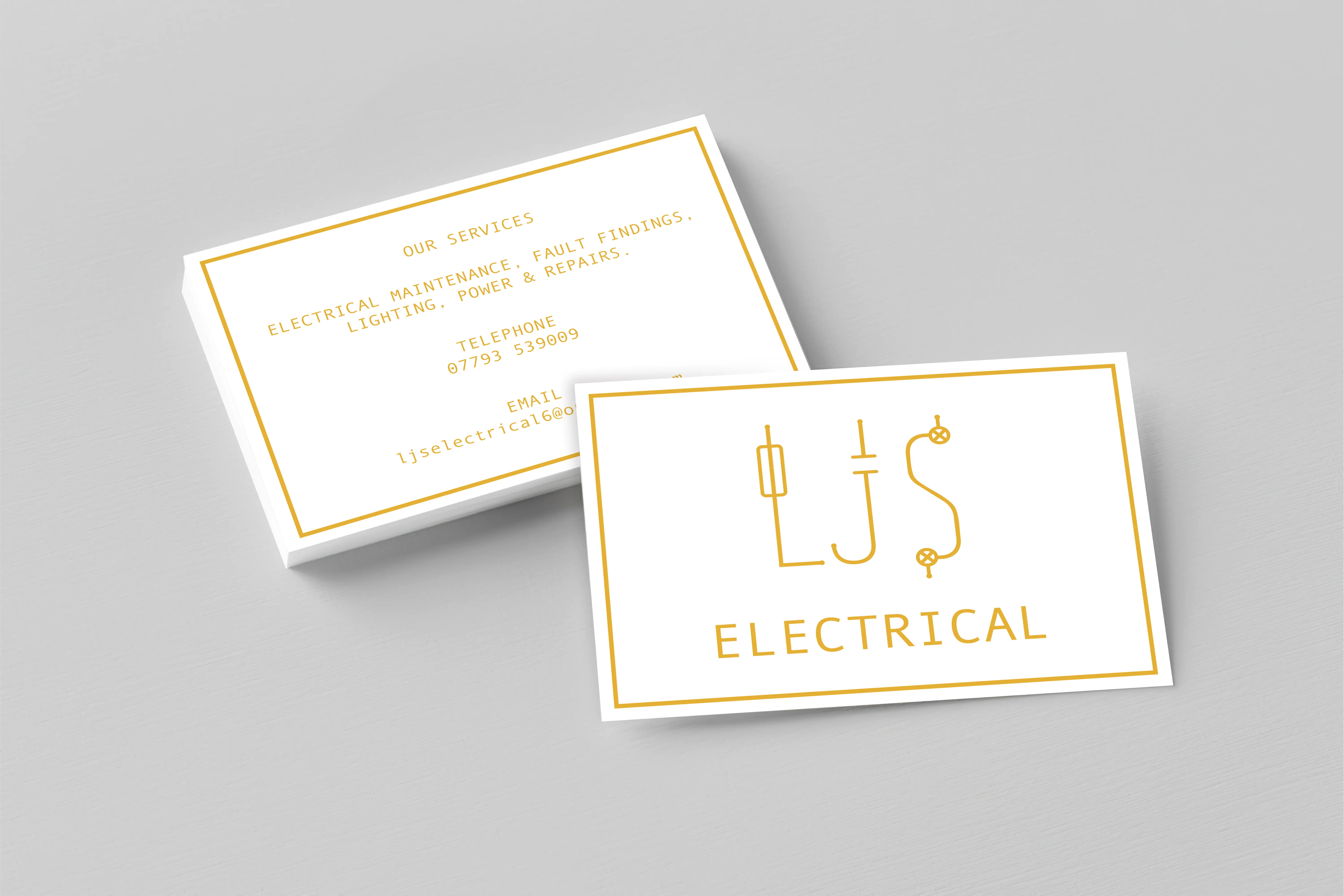
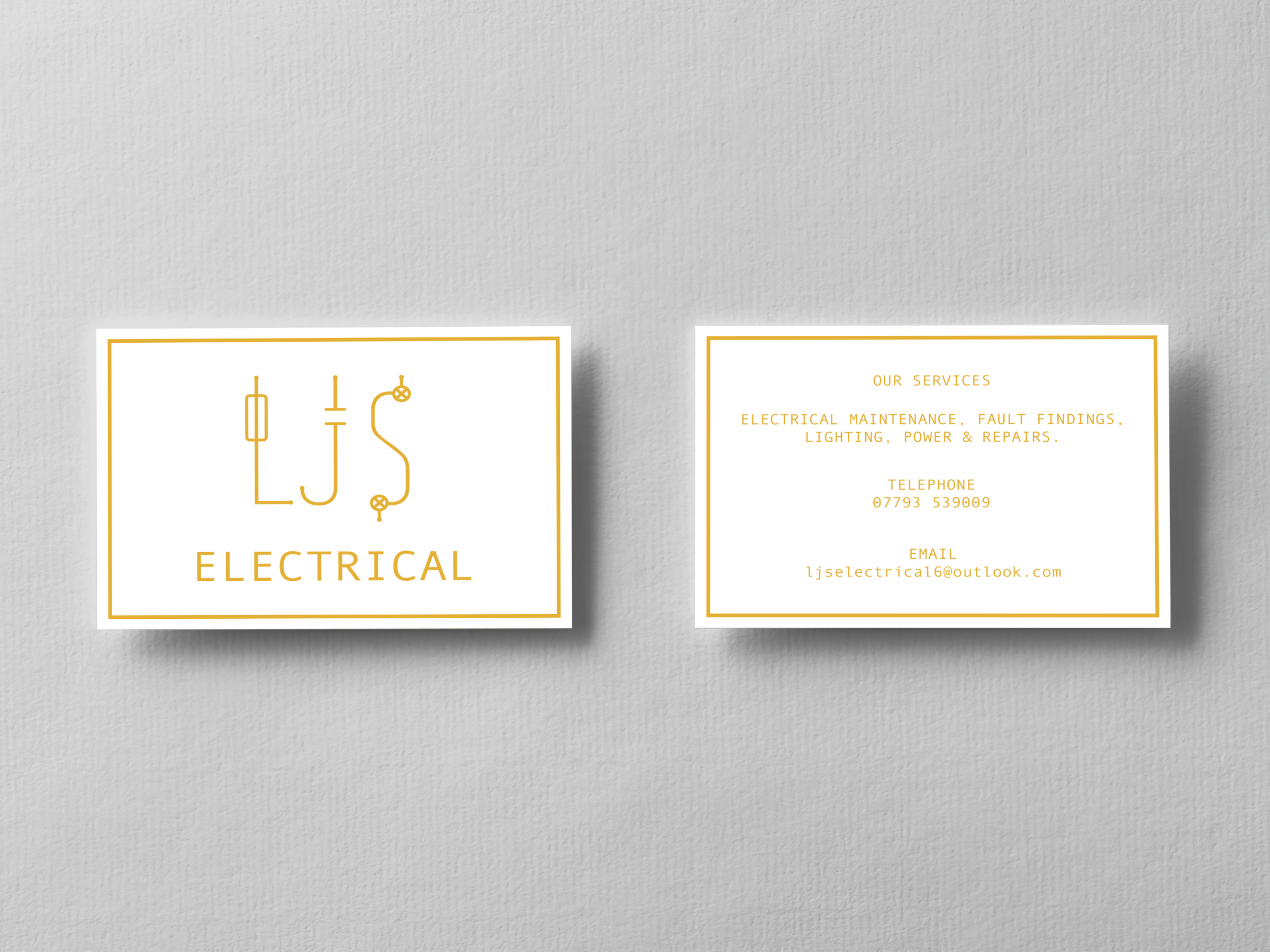
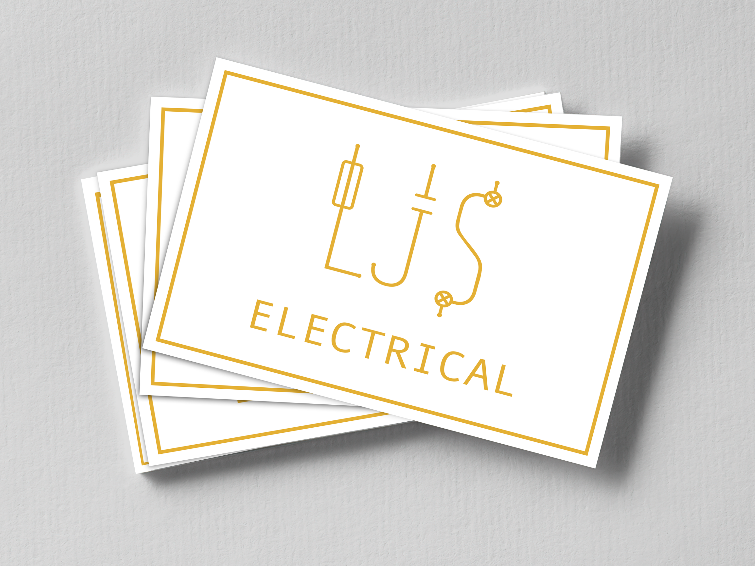
I researched UK electrical symbols and incorporated them subtly into the initials “LJS,” creating a logo that feels relevant to the industry while remaining straightforward and standing out against other competitors.
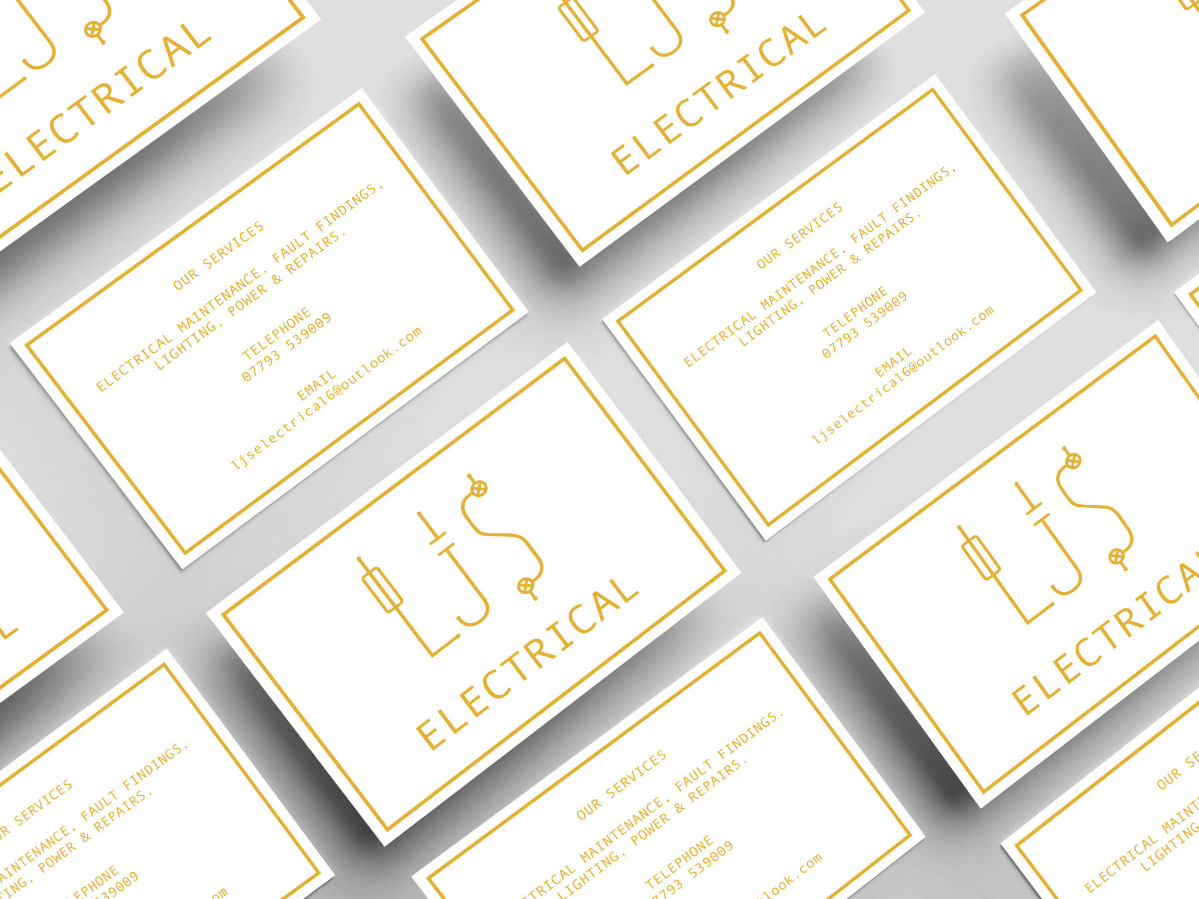
The final design uses a white and gold colour palette. Gold to represent energy and power, linking to electricity, and white to maintain a clean, modern look, resulting in a professional and cohesive business card design.

Ready to build something amazing?
I'd love to connect with you!